Quick answer
Send paid ad clicks to a dedicated landing page, not your homepage, in almost every case. A landing page matches the ad's promise, focuses on one action, and removes the distractions that leak expensive clicks, while a homepage is a general menu built for people exploring your whole brand. The homepage only wins for visitors who searched for your business by name. For everything you pay to reach, a focused landing page converts far better, and it often lowers your cost per click on Google too.
You did the hard part. You wrote the ad, picked the audience, won the auction, and paid for the click. Then you sent it to your homepage, where it quietly died.
This is the single most common way small businesses waste ad budget, and it has almost nothing to do with the ads themselves. The targeting can be dialed in and the creative can be sharp, but if the click lands somewhere built for browsing instead of buying, the money leaks out anyway. Homepage or landing page is a bigger decision than most people realize, and it is one of the rare changes that can lift results without spending an extra dollar on traffic. Let’s settle it.
Key takeaways
- The destination decides the outcome. The same ad and the same budget can convert two or three times better purely because the click lands on a focused page instead of a general homepage (illustrative, not a quote).
- A homepage answers “what does this company do?” A landing page answers “here is the one thing you clicked for, and here is the button.” Those are two different jobs, and one page cannot do both well.
- Message match is the hidden lever. The page should repeat the exact promise of the ad within the first screen, so nobody has to wonder if they landed in the right place.
- Every extra link is a small exit. Landing pages usually strip the navigation so the only obvious move is the action you paid for.
- On Google specifically, a relevant landing page can raise your Quality Score, which lowers your cost per click. A homepage often does the opposite.
- One landing page per offer or campaign beats one catch-all page that makes every visitor hunt for what applies to them.
What a homepage is for vs what a landing page is for
Before you can decide where a click should land, it helps to be clear on what each page is actually built to do. They are not competing versions of the same thing. They are two different tools, and the trouble starts when one gets asked to do the other’s job.
The homepage: a front door for everyone
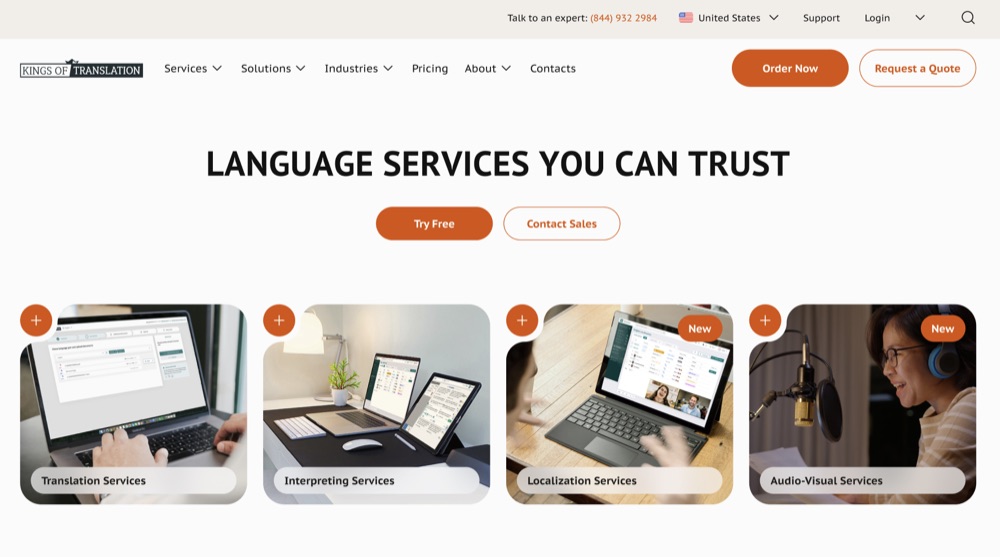
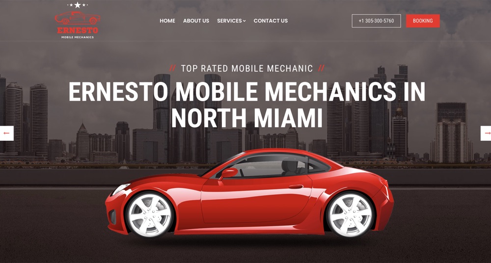
Your homepage has an impossible brief. It has to serve everyone at once: the first-time browser, the returning customer, the person comparing you to a competitor, the job seeker, the partner scoping you out. To do all of that, it offers choices. Lots of them. A navigation bar, a dozen links, several calls to action, and a little about everything you do.
That is not a flaw. For its real audience, it is exactly right. A homepage is a lobby, and its job is orientation: help people who arrived without a single clear intent figure out where to go next. Success looks like clear navigation, a confident overview of the business, and easy paths to whatever a visitor might want. It is a menu, and a good menu is a genuinely useful thing.
The landing page: a focused destination for one visitor
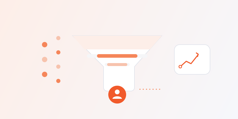
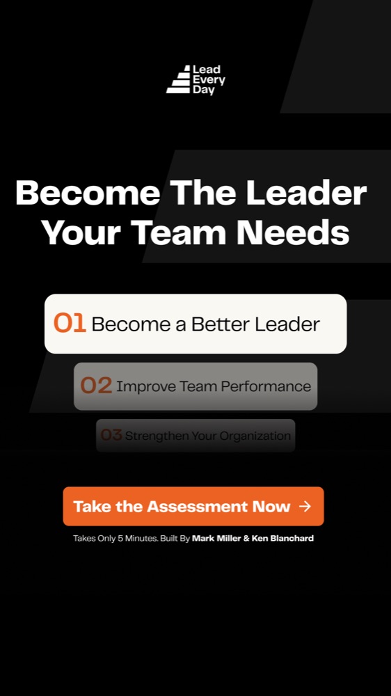
A landing page throws the menu away. It is built for one audience, arriving with one specific intent, ready to take one specific action. Everything on the page exists to move that one visitor toward that one action, and anything that does not serve that goal gets cut.
Where a homepage is a lobby, a landing page is a single door with a sign on it that matches the exact reason you walked up. It does not try to represent your whole business. It represents the one offer in the ad, in the visitor’s own terms, and then it asks for the click. Success for a landing page is not orientation. It is conversion.
Homepage vs landing page at a glance
| Purpose | Audience | Navigation | Number of actions | Best for | Typical use | |
|---|---|---|---|---|---|---|
| Homepage | Orient and introduce the whole business | Everyone (browsers, customers, job seekers, press) | Full nav and many links | Many competing paths | Building trust and helping people explore | Brand searches and organic visitors who came looking for you |
| Landing page | Convert one visitor on one offer | One specific audience from one ad or campaign | Stripped back or removed entirely | One clear action, repeated | Turning paid clicks into leads or sales | Google, Meta, email and any campaign you pay to run |
Why sending ads to your homepage wastes money
Someone clicked a specific ad about a specific thing. They arrive warm, with a reason, expecting that thing. Instead they get your entire business laid out like a menu with no waiter. Here is what actually goes wrong when that happens.
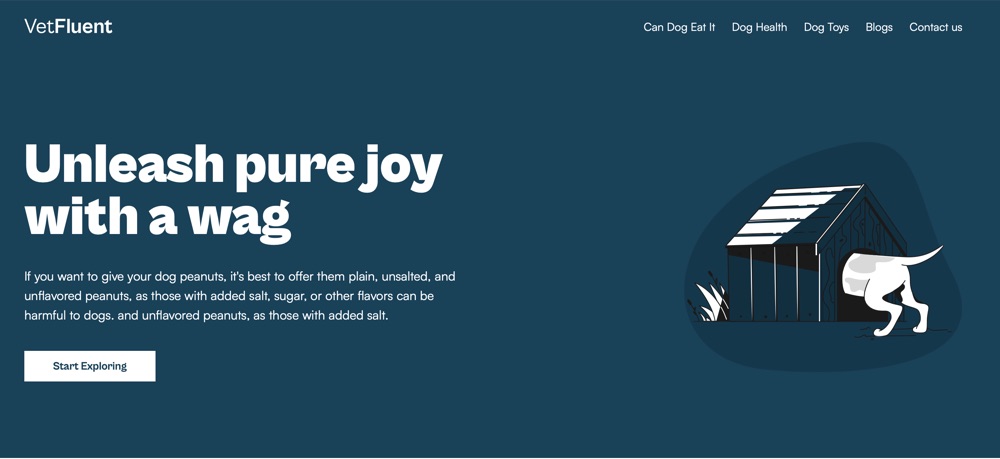
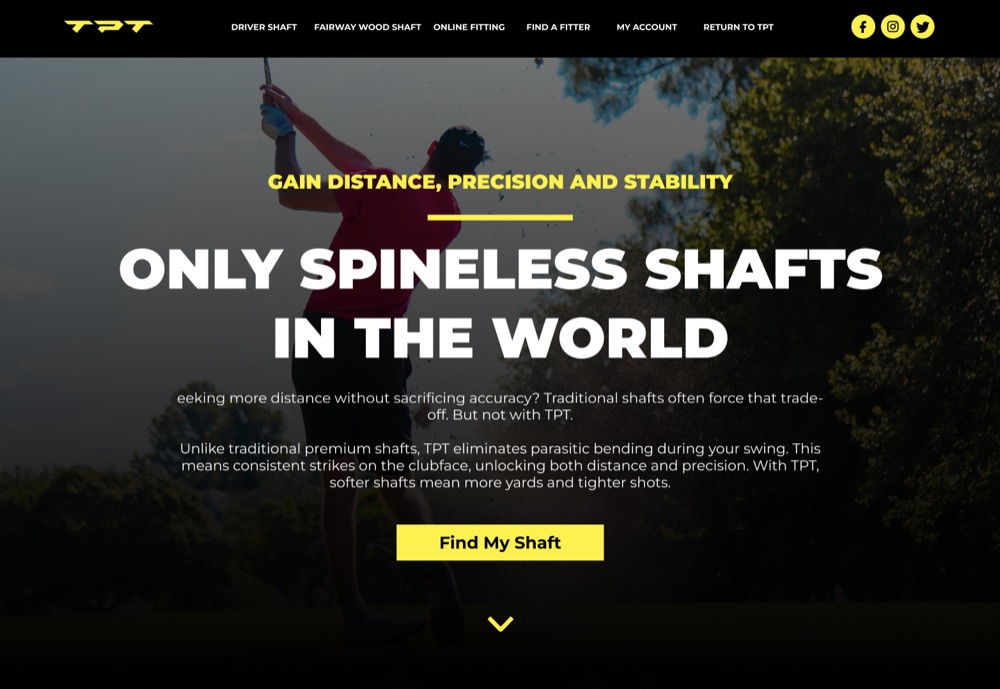
The promise breaks. The ad said “50% off your first month” or “book a free strategy call,” and the homepage says “welcome to our company.” That gap is a jarring little moment of doubt, and doubt at the top of a visit is expensive. Marketers call the fix message match, and the homepage almost never has it, because a homepage cannot echo an ad it knows nothing about.
Choice becomes paralysis. Every extra link is a chance to hesitate, wander, or leave. A visitor who could have clicked one obvious button now has fifteen things to consider, so a lot of them consider none of them and close the tab. You paid for a warm, specific visitor and dropped them into a room full of exits.
The intent leaks out. That click represented a person leaning toward action. The longer they have to hunt for the thing they came for, the more that lean flattens back into “maybe later,” which in practice means never.
On Google, you pay a tax for it. Google scores how relevant your destination is to the keyword and ad, and folds that into Quality Score. A tightly matched landing page can lower your cost per click and improve your position. A generic homepage tends to score worse, so you pay more per click and convert less of it. That is the double loss, and it compounds every day the campaign runs. If you want the fuller picture on what those clicks cost, how much Google Ads cost breaks the math down.
Phones make it worse. Most ad clicks happen on mobile, where a homepage’s navigation and many sections turn into a long scroll of things that are not the point. Attention on a phone is measured in seconds, and a homepage spends those seconds on orientation instead of the one thing the visitor wanted.
Put simply: you optimized the ad and then handed the click to a page that was never built to close it.
Anatomy of a high-converting landing page
The good news is that a page built to convert is not mysterious. It is a short list of ingredients, and most winning landing pages have all of them. Miss two or three and conversion sags, no matter how good the traffic is.
A headline that matches the ad
The first thing on the page should echo the exact promise of the ad, in words the visitor recognizes. If the ad said “same-day onboarding,” the headline says “same-day onboarding,” not “solutions for modern teams.” This is message match, and it is most of the battle. It removes the “wait, am I in the right place?” pause and tells the visitor, in one line, that they landed exactly where the ad pointed them.
One offer
A landing page makes one promise. Not a tour of everything you sell, not three tiers to weigh, just the single offer the ad was about. The moment a page presents two or three things to choose between, it stops being a landing page and starts being a small homepage, and the choice paralysis creeps back in.
One call to action
There should be one thing you want the visitor to do, and it should appear more than once as they scroll: near the top, in the middle, and at the end. Same action, same wording, same button. When every button on the page points at the same next step, there is no decision to stall on, only a decision to make.
Proof and social proof
People do not convert on a claim alone. They convert when the claim feels safe to believe. That is what proof is for: testimonials, real results, recognizable logos, ratings, a guarantee, a clear count of customers served. It answers the quiet question sitting behind every offer, which is “why should I trust you with this?” Honest, specific proof beats vague superlatives every time.
No distracting navigation
This is the change that surprises people most. On a landing page, the full navigation bar usually comes off. No links to the about page, the blog, the careers page, or the ten other services. The logic is simple: every link that is not your call to action is a competitor to your call to action. Narrow the path until the only obvious way forward is the one you paid to send them down.
Fast load and mobile-first
A slow page loses visitors before they read a word, and on a phone a page that jumps, reflows, or takes three seconds to appear is a page that gets closed. Build for mobile first, keep the file weight down, and treat speed as a conversion feature, not a technical nicety. The fastest page in the auction often wins clicks it did not technically deserve, simply because it was the one that actually loaded.
None of this requires a huge production. It requires discipline: one message, one action, proof, speed, and the ruthlessness to cut everything else. That focus is exactly what landing page and funnel design exists to build, and it is why we tell clients to fix the destination before they scale spend.
When a homepage is the right destination
Honesty matters, so let’s be clear that the homepage is not always the wrong answer. There are real cases where sending traffic to it is correct.
- Brand searches. If someone types your company name into Google, they already know you and are navigating to you on purpose. They want the front door with all its paths. Send them to the homepage and let them explore.
- Very simple, single-offer businesses. If your business does exactly one thing and your homepage is already, in effect, a landing page (one message, one action, no clutter), you may not need a separate page. Just make sure it genuinely behaves like a landing page and is not a homepage wearing the label.
- Retargeting people who already know you. Warm audiences who have visited before, opened your emails, or engaged with your brand can handle the homepage, because they are not meeting you cold. Even then, a matched page usually still wins.
- Tiny early experiments. Before you have spent real money, sending a trickle of traffic to the homepage to see if anyone bites can be fine. The moment you put a real budget behind ads, though, this is a false economy. A page you did not build is quietly taxing every click you paid for.
The rule underneath all of these: if your traffic is people who already know you and are navigating to you, the homepage is the right front door. For everyone you are paying to reach cold, it is the wrong place to land.
Landing page vs full funnel
A landing page is one step, not the whole system. It is easy to build a great page, watch it convert better than the homepage, and then assume the job is done. It is not, because most people who click your ad will not buy on the first visit no matter how good the page is.
A funnel is the sequence around the page: the ad brings the click, the landing page converts it into a lead or a first action, a thank-you step sets up what happens next, and follow-up (usually email) keeps working on the people who were interested but not ready. The landing page catches the visitors who are ready right now. The rest of the funnel catches everyone else, over the days and weeks that follow.
Skip the follow-up and you are throwing away most of the value in your traffic. The people who did not convert on visit one are not gone; they are just not ready yet, and a simple sequence of emails often earns more than the first-visit conversions did. This is why the email flows every business should set up first belong right next to your landing page in the plan, not as an afterthought.
Zoom all the way out and conversion is the middle step in getting more customers online: traffic brings people in, the landing page converts the ready ones, and follow-up harvests the rest. A landing page fixes the middle. A funnel makes sure the other two steps are not leaking either.
Common landing page mistakes
Even teams that know they should use a landing page often blunt its edge with a few avoidable errors. Watch for these.
- Sending ads to the homepage anyway. The original sin. It undoes the work before it starts.
- Breaking message match. The ad promises one thing, the page leads with another. The visitor’s first thought becomes doubt instead of recognition.
- Too many calls to action. “Book a call,” “download the guide,” “start a trial,” and “see our work,” all on one page. Pick one. Competing actions cancel each other out.
- Asking for too much, too soon. A twelve-field form for a first touch scares people off. Ask for the minimum you need to take the next step, and earn the rest later.
- No proof. A confident claim with nothing behind it reads as a risk. Give people a reason to believe before you ask them to act.
- Keeping the full navigation. Leaving the nav bar on hands every visitor a menu of exits. Strip it.
- Slow or clumsy on mobile. If it is not fast and clean on a phone, most of your paid clicks never see the offer.
- One page for every campaign. A single catch-all page forces each visitor to filter your business down to what applies to them. That filtering is friction, and friction is lost conversions.
- Burying the action below a wall of text. If a visitor has to scroll past six paragraphs to find the button, plenty of them never will.
- No follow-up behind the page. Even a perfect landing page only catches the ready-now buyers. Without email follow-up, everyone else walks.
A before and after: what changing the destination does
Here is how the difference tends to look in practice. The numbers below are illustrative, not a quote, and every business is different, but the shape of the change is consistent.
Picture a software company running paid ads for a free trial of its invoicing tool, on a budget of $3,000 a month. In the first version, every click goes to the homepage. The homepage leads with a broad brand message, a full navigation bar, links to pricing, features, about, and the blog, and the trial button sits below the fold. Of roughly 1,000 clicks, about 1.5% start a trial. That is 15 trials at a cost of around $200 each.
Now change nothing about the ads and only change the destination. The clicks land on a dedicated page whose headline reads “Start invoicing in five minutes, free for fourteen days,” matching the ad word for word. There is one offer, one repeated call to action, a row of customer logos and a rating for proof, no navigation bar, and a page that loads fast on a phone. The same 1,000 clicks now convert at around 4%. That is 40 trials at a cost of about $75 each.
Same spend, same traffic, more than double the trials at roughly a third of the cost per trial. Nothing about the ad account improved. The only thing that changed was where the click landed, which is why the destination is the first thing we fix, not the last.
The bottom line
Your ads do not fail at the auction. They fail at the destination. Sending paid clicks to your homepage forces expensive, warm visitors to navigate a menu instead of taking the one action you paid for, and on Google it can quietly raise your cost per click on top of that. A focused landing page that matches the ad, offers one path, and proves the case will out-convert a homepage almost every time. Reserve the homepage for the people who came looking for your brand by name.
The cleanest way to think about it: buy the traffic once, then make the destination earn it. That is the job of landing page and funnel design, and it pairs naturally with the PPC management that fills the top of the funnel. If you are still deciding where to buy the clicks in the first place, Google Ads vs Meta Ads is the place to start.
At AryzeTech, one connected team builds, grows and automates on a flat monthly retainer, so the page, the ads, and the email follow-up are handled together instead of scattered across three vendors who never talk to each other. Want us to build the page your ads deserve? Book a call and we will turn expensive clicks into customers instead of bounces, or see pricing to find the plan that fits.